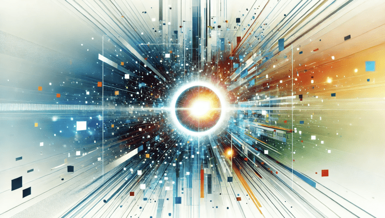
At Bl3nd Design, your friendly local graphic design agency based in the Fraser Valley of British Columbia, Canada, we live and breathe colour. Every project we touch begins with one simple but profound line of thinking: what emotion, mood, or feeling should this brand evoke the moment someone lays eyes on it? But this blog post article isn’t about a trending colour palette, a seasonal colour guide, or a typical design topic. This is a moment of visual history — the kind of event that transcends the creative industry and touches the deeper layers of how we see and interpret the world.
A group of scientists from UC Berkeley and the University of Washington School of Medicine have successfully made five people see something no human had ever seen before. A new colour. It’s called olo — and it’s not just a variation or shade of an existing hue, but a perceptual experience entirely outside the normal limits of human sight. This was made possible through a remarkable piece of optical technology that targets the M-cones in the human retina with laser precision, isolating them in a way natural light never can. The result is not just scientifically important — it also hints at a new future for how we use colour in communication, branding, and emotional design.
Let’s begin by exploring how colour works inside the human visual system.
How the Eye Translates Light into Colour
Colour isn’t a thing in the world. It’s a construct of perception — a product of light interacting with biological hardware and neural computation. When electromagnetic radiation (light) enters the eye, it passes through the cornea, pupil, and lens, eventually striking the retina — a light-sensitive tissue that lines the back of the eyeball. Embedded within the retina are millions of photoreceptor cells: rods, which handle night vision, and cones, which enable us to see colour.
Humans normally have three types of cone cells. S-cones detect short wavelengths (peaking near 420 nanometres) and give us the sensation of blue. M-cones respond to medium wavelengths (peaking near 534 nm) and are associated with green. L-cones are tuned to long wavelengths (peaking near 564 nm), corresponding to red. Together, these cones encode a rich and varied range of hues by activating in overlapping proportions — a model called trichromatic colour vision.
The human visible spectrum spans approximately 380 to 750 nanometres, and we divide that range into primary chromatic regions:
- Violet (380–450 nm)
- Blue (450–495 nm)
- Green (495–570 nm)
- Yellow (570–590 nm)
- Orange (590–620 nm)
- Red (620–750 nm)
In addition to those categories, our brain interpolates millions of subtle in-betweens — the aquas, crimsons, corals, lavenders, and countless gradients we encounter every day. But here’s the catch: no light naturally stimulates just one cone type at a time. When M-cones activate, the L- or S-cones are stimulated too. Their sensitivities overlap. There has never been a wavelength that makes the M-cones fire independently. And so we’ve never known what it would look like if they did.
Until now.
Breaking the Limits of Natural Vision
The discovery of olo emerged from a sophisticated experimental system known as Oz — a high-precision retinal stimulation platform developed by researchers Ren Ng, Austin Roorda, and their colleagues. Oz uses adaptive optics and laser microdoses to deliver focused beams of light to individually mapped photoreceptors within a subject’s retina. Each person’s cone mosaic is unique, so every session begins with a full retinal mapping using optical coherence tomography. Once the M-cones are isolated and located, the laser system stimulates them directly — without activating any S- or L-cones.
The result is astonishing. Participants describe seeing a blue-green hue of unprecedented saturation — not a brighter green, but a qualitatively different experience. Ng compared it to spending your entire life seeing only pale pinks, and then one day encountering true red for the first time. Olo wasn’t just new; it was vivid, pure, and emotionally striking. Even a laser beam tuned to a traditional green looked pale by comparison.
The team verified this colour experience using comparison and matching tasks. Subjects were asked to match olo against other colours using adjustable hue and saturation dials. In every case, they had to desaturate olo to make it resemble a highly saturated teal — confirming that olo lies outside what current technology and natural vision can display.
From Lab Bench to Brand Identity
This discovery is a breakthrough in vision science, but its implications ripple far beyond neuroscience journals. For designers, marketers, and brands, olo is a reminder that colour is not a static system — it is a living, expanding language. As new technologies emerge that stimulate photoreceptors in novel ways — even hypothetically bringing olo-like experiences to AR, VR, or future visual displays — we may enter a design era where the palette grows in dimensions, not just variety.
Even today, within our existing spectrum, the ability to harness colour effectively is a competitive advantage. Brands don’t just choose colours for aesthetics — they use them to influence perception, trigger emotion, and establish memorability. Colour is shorthand for trust, excitement, innovation, elegance, sustainability, rebellion. Think of the regal richness of deep purple, the clinical clarity of white and blue in healthcare, or the energy and appetite triggered by a bold red.
The discovery of olo challenges us to think bigger. If entirely new hues are possible, then the way we classify, assign meaning to, and deploy colour must evolve. The visual experiences of tomorrow may involve deeper colour fields, programmable pigments, cone-specific displays, and even neuro-visual branding cues.
Building Smarter Colour Systems Now
At Bl3nd Design, we help brands establish strategic, emotionally intelligent colour systems that anticipate this kind of evolution. It’s not about picking a few hex codes and calling it a day. It’s about layering warmth and coolness, playing with vibrancy and tone, considering accessibility and contrast, and aligning every colour choice with a brand’s core personality and promise.
We also offer standalone colour consulting services to clients who want to begin their journey with a deeper understanding of colour logic before diving into a full graphic design client engagement. Whether you’re launching a new business, refreshing a dated identity, or preparing to enter new markets, your colour strategy is the front line of perception.
A World That’s Becoming More Colourful
Olo isn’t just a laboratory curiosity. It’s proof that we’ve only just begun to explore the richness of what colour can be. It reminds us that perception is limited not by imagination, but by biology — and that technology can open those limits. The future of design will not only require creative vision but perceptual fluency — the ability to design not just for what people see today, but for what they might see tomorrow.
We want to hear from you below. 👇
What are your favourite colours?
What palette defines your brand?
If you could create a colour no one’s ever seen before, what would it express?
Drop a comment below and join the conversation. The spectrum is shifting — let’s explore it together. 🎨🔬
Related Links
The Guardian
Scientific American
The Atlantic
Popular Science
CTV News
Nature.com
Smithsonian Magazine
Design Boom